


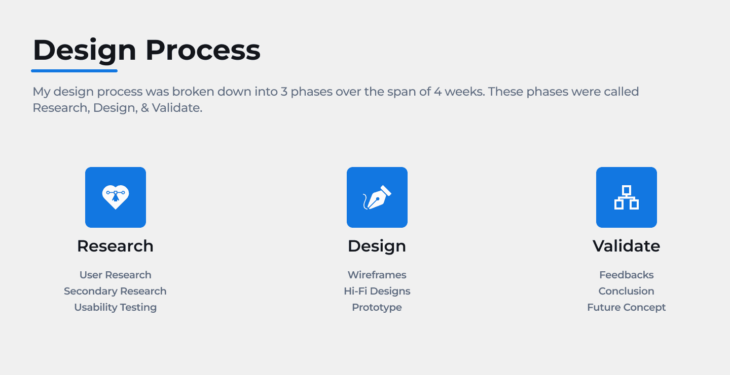
We had 4 weeks to work on this project
We had to improve upon the Voting Feature of the App
My team consisted of 3 members that took on different roles throughout the course of the project.
Luigy Rivas - Team Leader, Research, Design, Usability Testing
Cheresha Watts - Research, Design, Usability Testing
Albert Andersson - Research, Design, Usability Testing
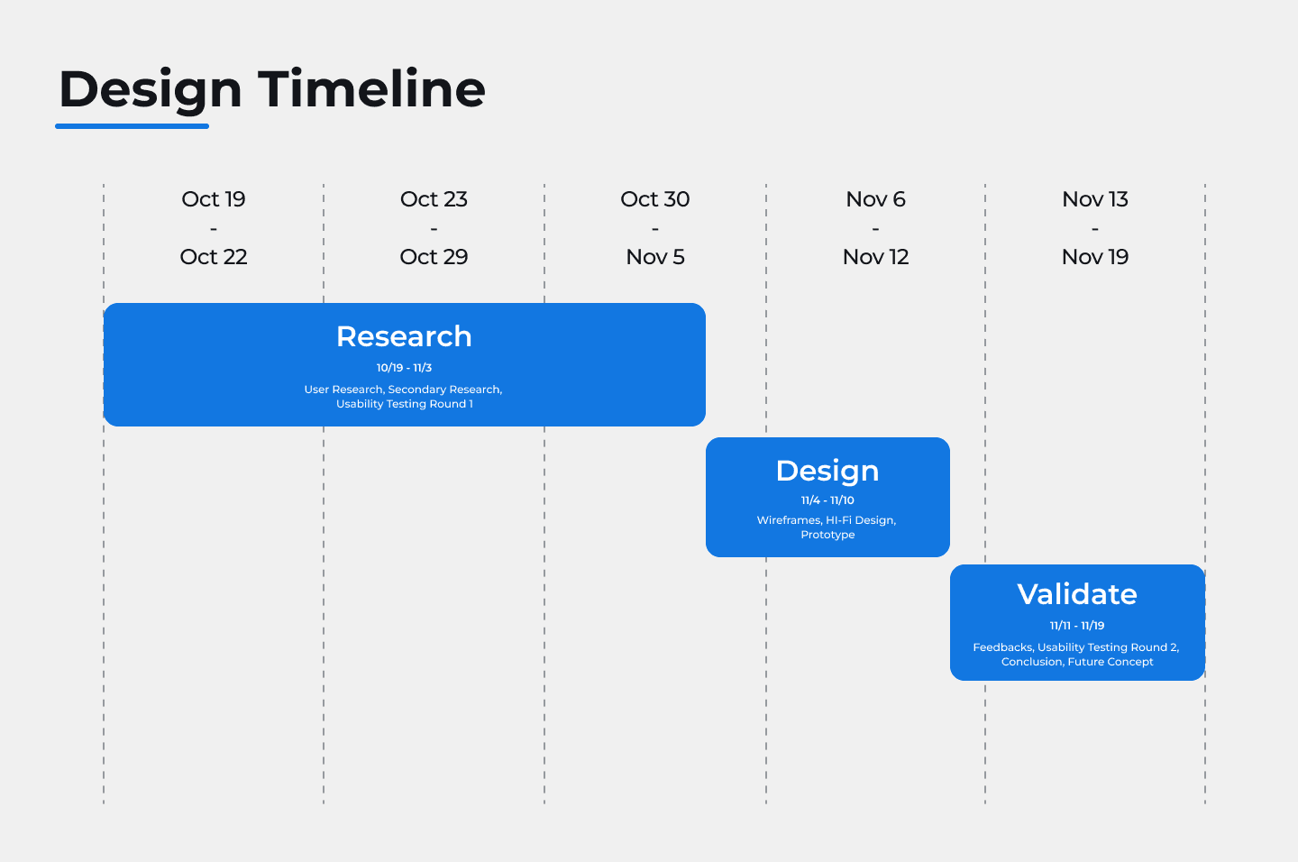
Oct 19, 2023 - Nov 17, 2023 (4 weeks)
In order to give users a voice in Corporate America & create a feedback loop, the beta app has incorporated a voting feature with the hopes of having users share their opinions on the companies they follow. However, they haven’t seen enough engagement or use of it with users.
Our goal was to understand the behavior of users and see why they weren’t engaging with the voting feature. As well as come up with solutions on how we could improve upon it.

The focus was to research the necessities & issues users had when it came to the Share Scoops beta app.
User Behavior
In order to understand the behavior and psychology of users when it came to voting, we conducted some secondary research into multiple sources from articles to previous research findings done by the client.
Secondary Research:
Common Experiences:
From previous reports that we read about from past usability tests. We learned that that these were the common plights users had with the voting feature of the app
Users didn’t understand what the purpose of the “voting feature” was for.
Users didn’t see how this “voting feature” could benefit them in the long term.
Users didn’t know or believe that their voice/opinion would actually be considered to create some sort of positive impact.
Relevance:
From the articles we read, we learned one of the key elements in getting people to vote was to ensure the topics they were voting for were relevant in our case they had to connected financial decision-making concerns. For ex:
Current financial news
Investment options
Student loans or loans in general
Housing Market
Engagement:
Also from our readings, another key element to influenced people to vote was their ability to connect with one another. While voting, people like to interact with one another for several reasons like:
Learning about the another individual’s opinion on the matter
Learning more about the issue or reason they are voting on
Understanding how their vote could contribute to the greater good
Incentives:
Lastly, we read that users may not be participate in voting unless they knew there was going to be something to gain for their contribution. List below were some ways that people could be rewarded:
Incorporating a point system that gives them access to different types of prizes
Getting discounts on certain services/product
Having exclusive access to certain financial resources
Usability Testing - Round 1
After conducting our secondary research on user behavior when it came to voting and understanding the common experiences users had with the “voting feature” of the Share Scoops app. We decided to gather primary research by conducting a usability test with 6 participants.
Different Types of Test:
With this first round of usability testing, we had to test out 2 distinct elements that our client Share Scoops was working on for the app.
The first was to test out the their most up to date “Voting Feature” for their beta app.
The second was to do a A/B test with different copy writings that would be shown in the voting screens.
Voting Feature Test
Setup:
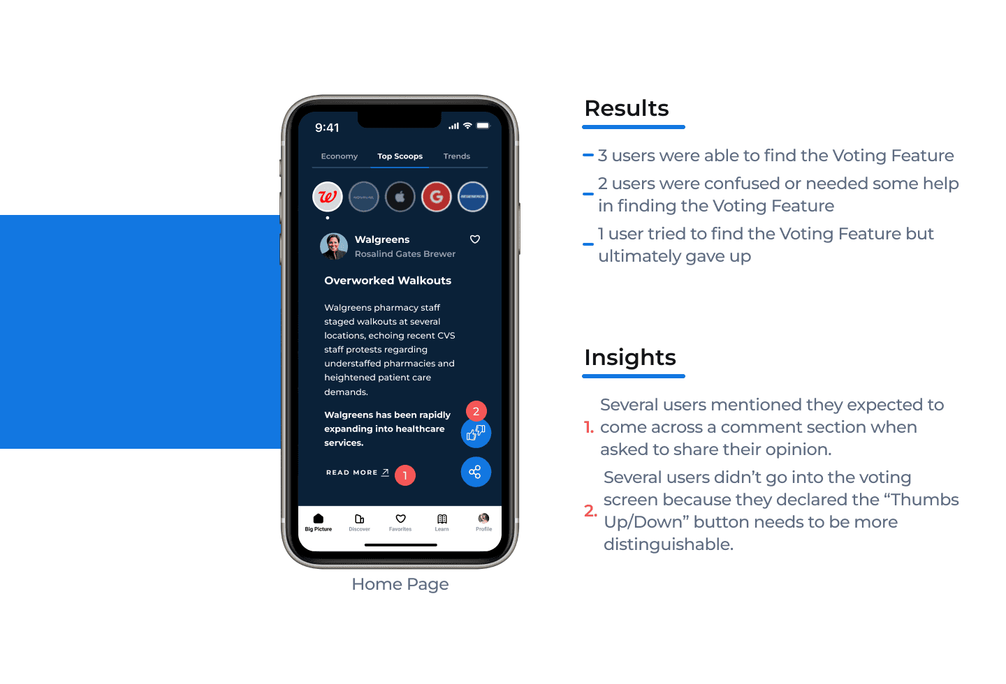
We tested the 6 participants in 3 different tasks related to the Voting Feature of the app.
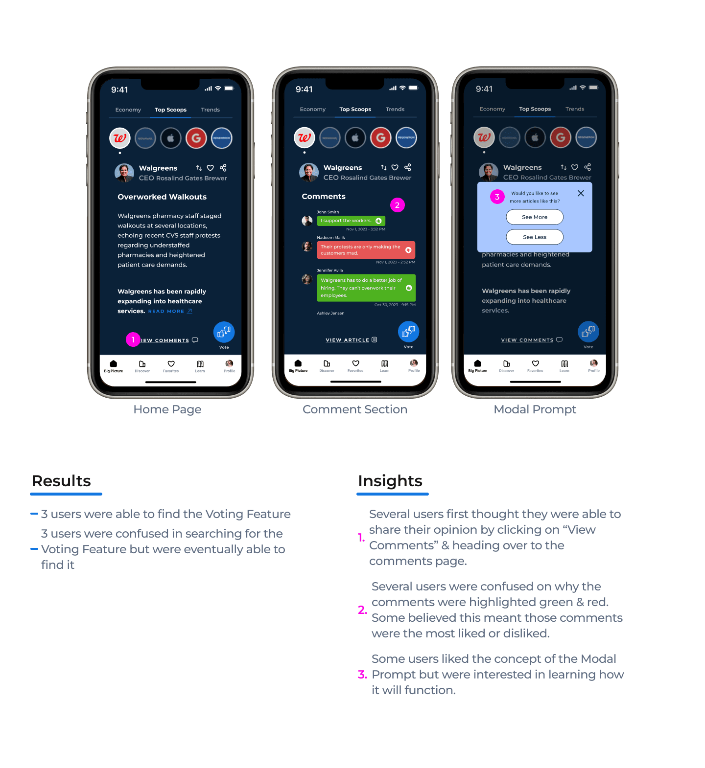
Discoverability & Navigation
This task was to determine if users can easily find the voting feature button & screens within the app interface without external guidance.
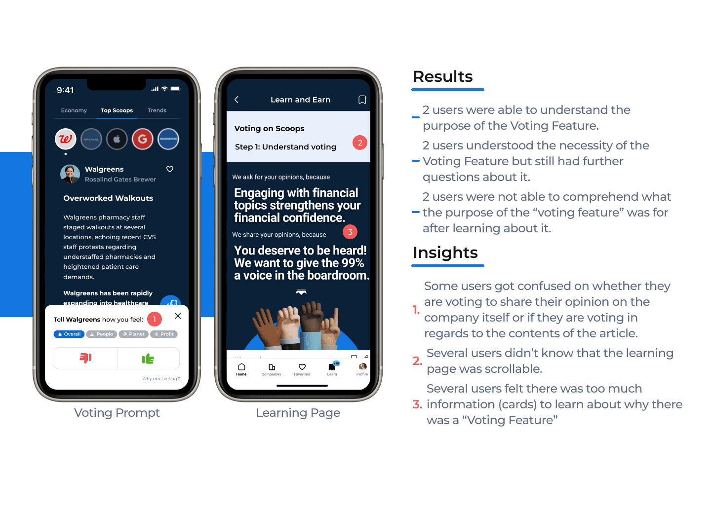
Understanding the Purpose
This task was to evaluate whether users understood the purpose and significance of the voting feature based on the resources provided to them.
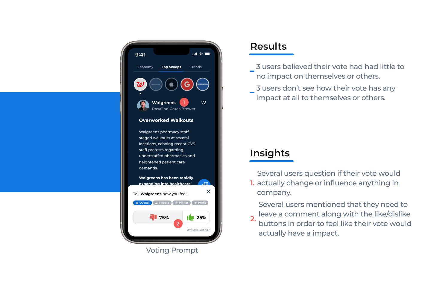
Perceived Value
This task was to gauge whether users believe that their votes have a meaningful impact on their financial investing confidence and/or on their financial literacy.
Discoverability & Navigation
Understanding the Purpose
Perceived Value
Recommendations
Critical Priority
Issue:
Users couldn’t clearly recall the full purpose of voting feature:
Users were confused and couldn't remember the purpose of the voting feature after reading through resources.
The users thought the “thumbs up and down” was also used to tell the share scoop app what news articles they liked and disliked in hope the algorithm showed them more of the content they thumbs up (like).
Recommendation:
Reduce the amount of resources used to explain the voting feature and have one concise document that explains the reason for voting.
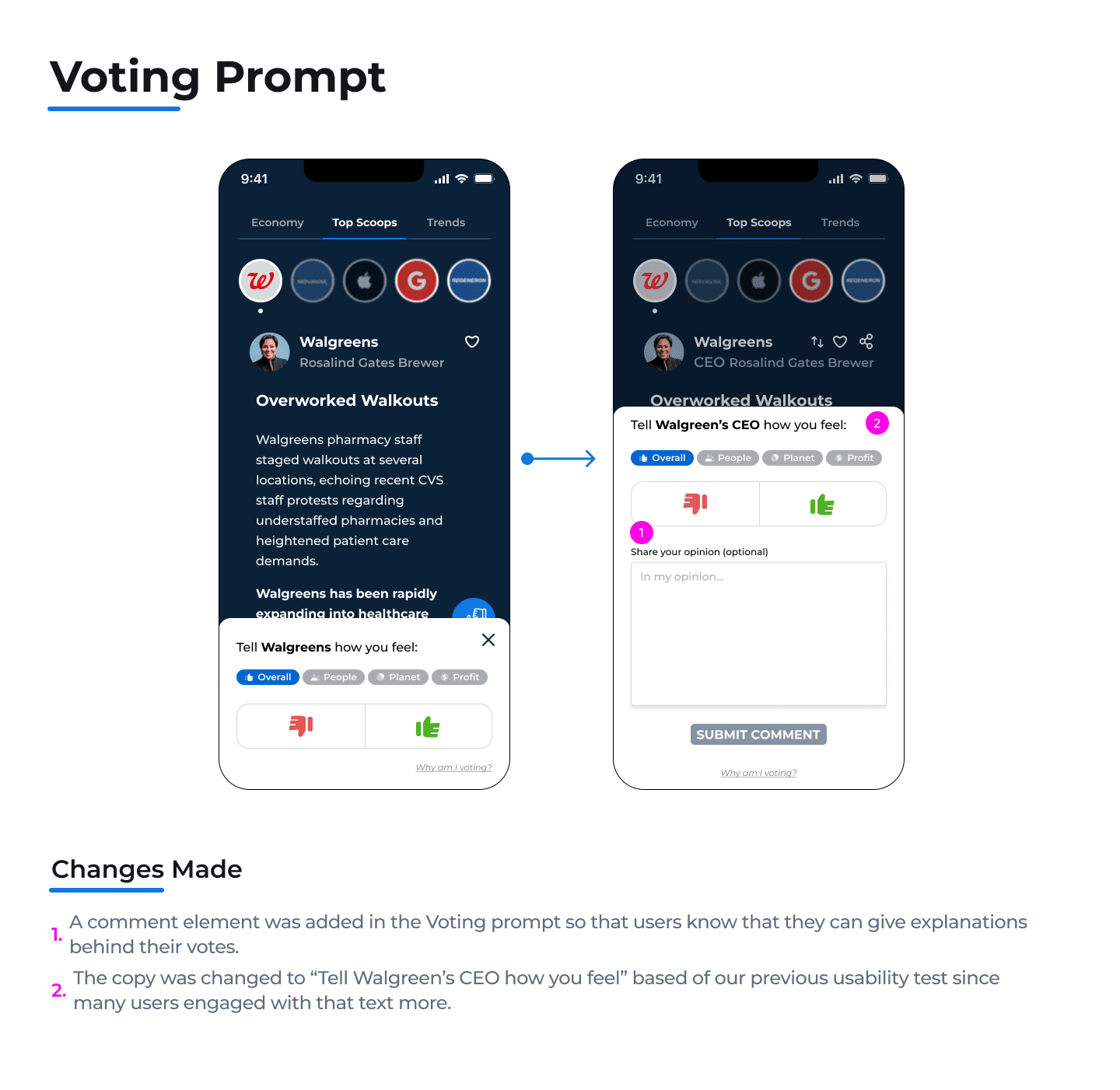
Issue:
Users felt the voting process wasn’t meaningful impactful. One user felt it could be impactful only if the
companies are actually seeing the results.
Recommendation:
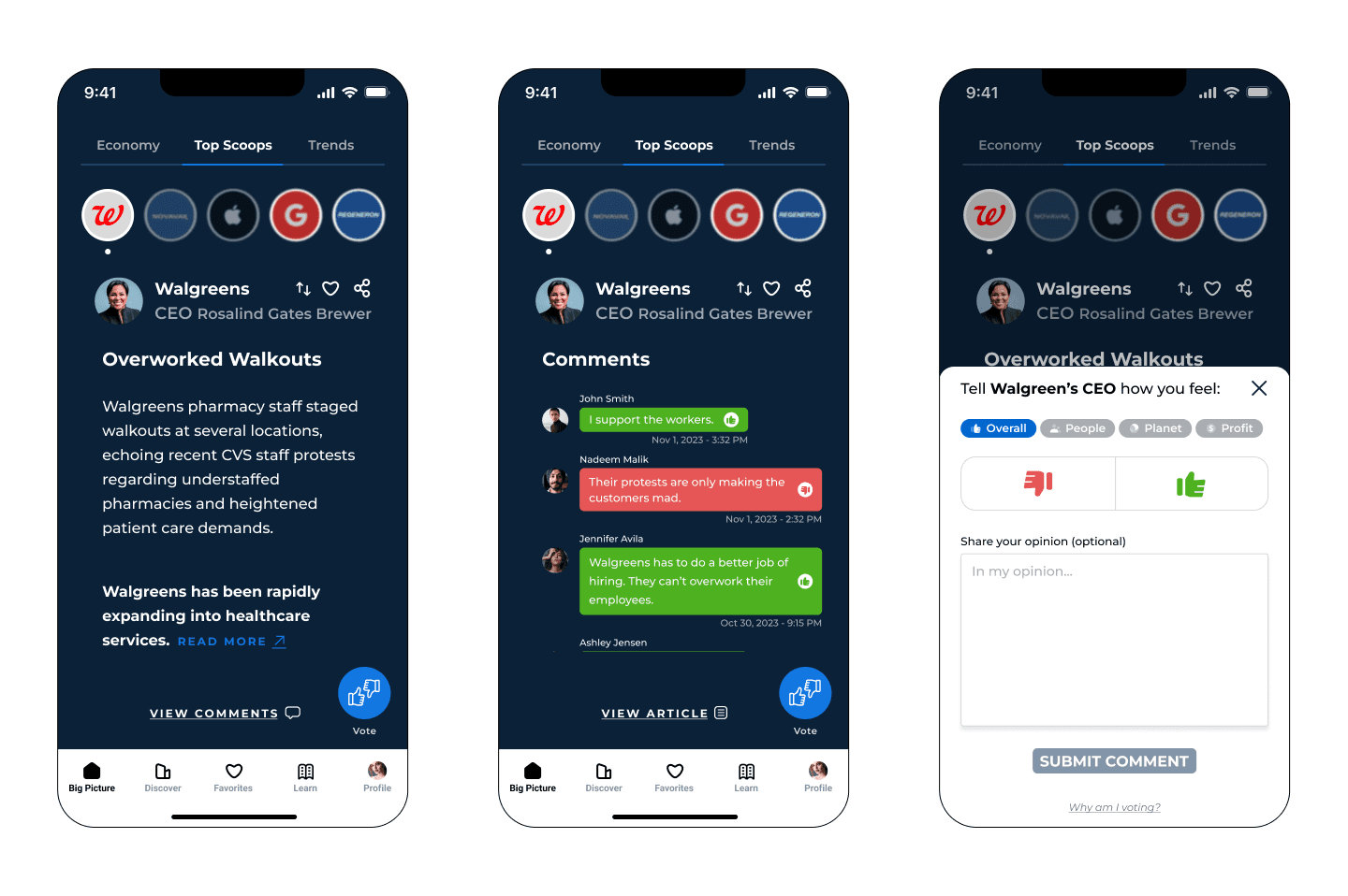
Add a comment box for users to actually have a voice and express how they feel. This will also open an opportunity for users to engage with each other.
Major Priority
Issue:
Participants were confused about what they were actually voting on:
(mainly due to the wording/copy: Participants didn't know if thumbs up means they agreed with the walkouts or if the thumbs down meant they disliked walgreens understaffing their pharmacies).
Recommendation:
Ensure the copy is clear for users to understand and aligns with the purpose of the voting feature.
Major Priority
Issue:
Participants had trouble locating the voting feature
button due to not understanding what the voting icon
meant:
Participant thought it was used to like or dislike the article and not used to express their opinion about the article.
Participants were looking for a “comment section” in order to share their opinion.
3 out of 4 users felt the feature they were looking for would be under the “read more” link.
Recommendation:
Create an orientation flow for new users that highlights the major functionalities of the app. This will
help users get acquainted with the capabilities and features of the Share Scoops beta app.
Minor Priority
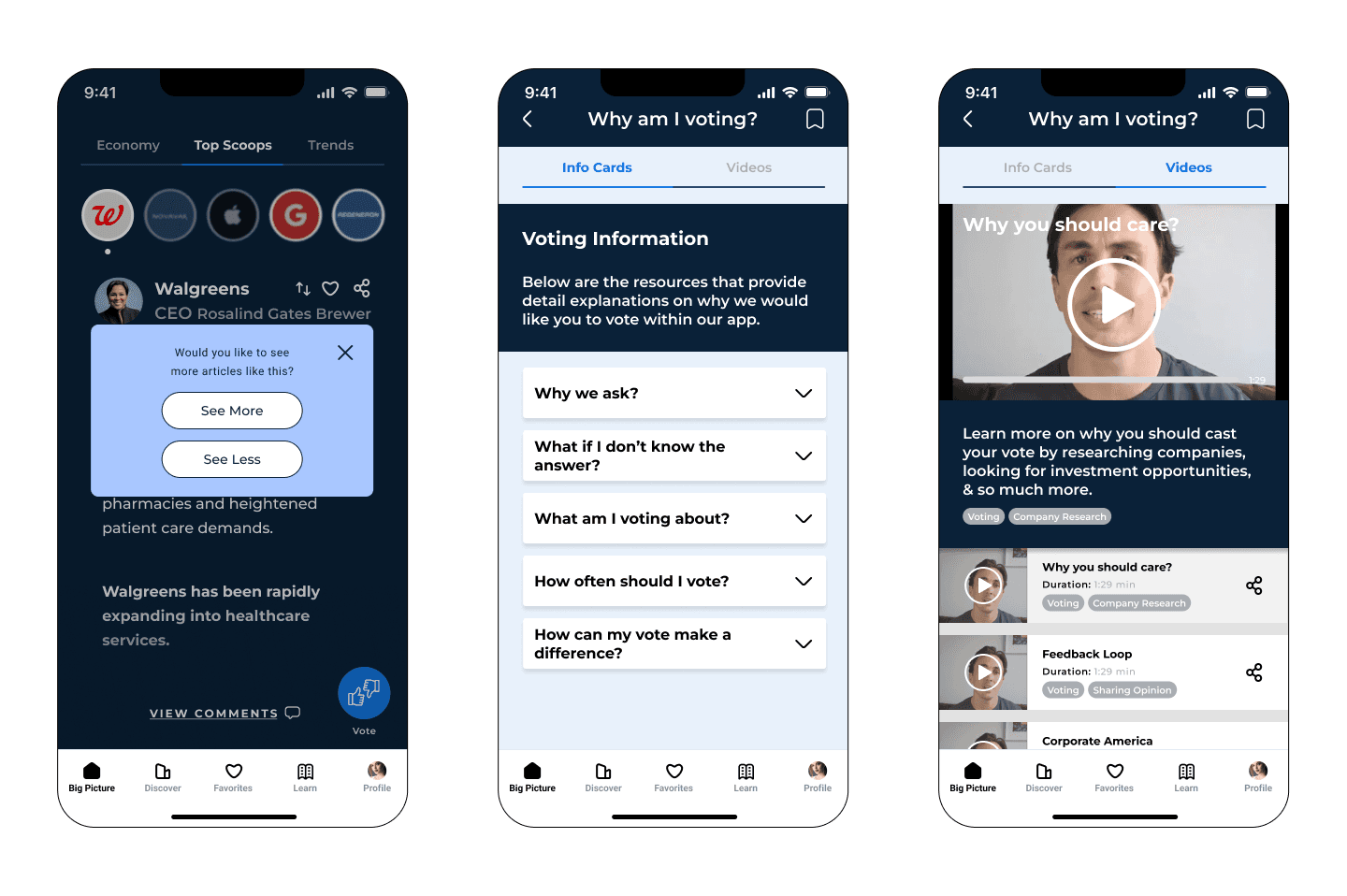
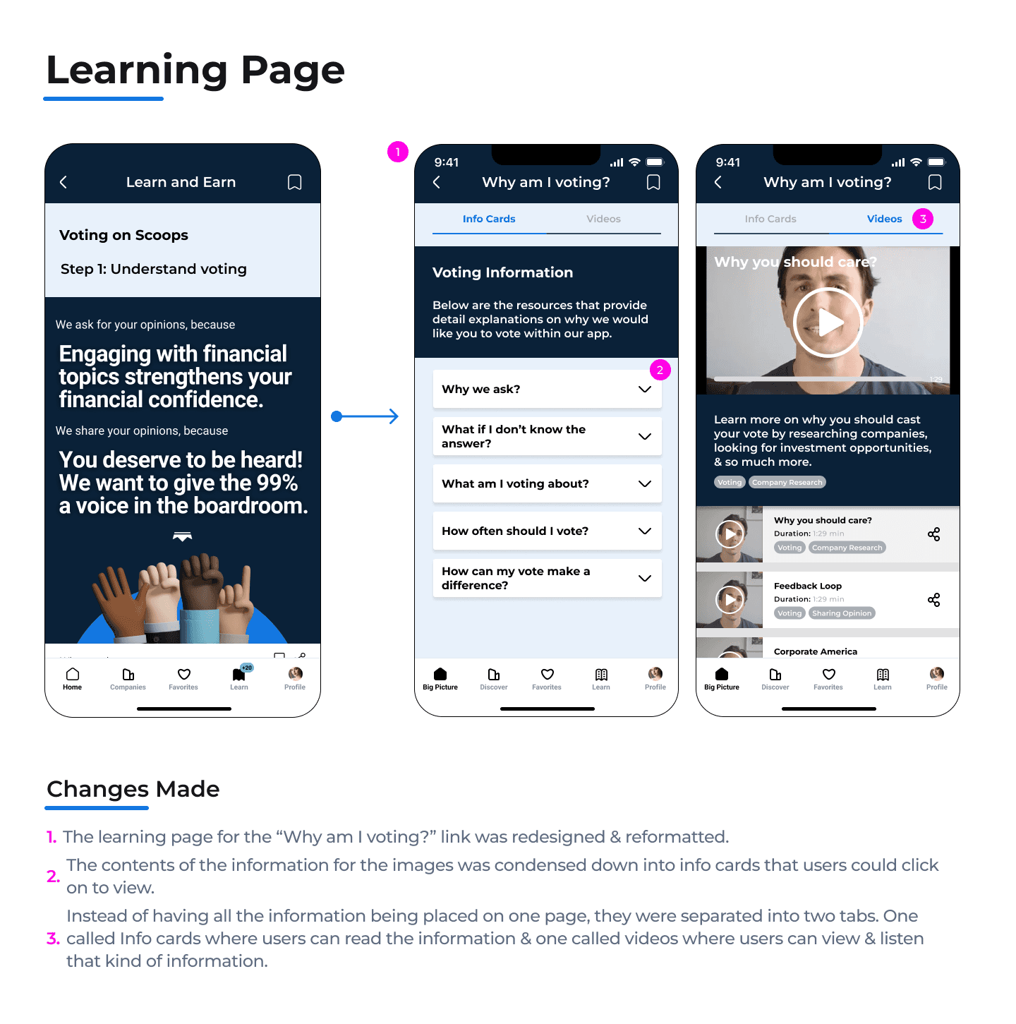
Issue:
“Why am I voting” learn more screen, there is no
indication that tells users there is more content
below.
(Participants were unaware there was more content for them to scroll through).
Recommendation:
Decrease the length of the resource cards so users can see a portion of the card below. This will indicate to the user the ability to scroll.
Minor Priority
Issue:
Confusion with the heart feature:
Does it mean I like Walgreens or does it mean I like this article?
Recommendation:
Add a “3 dot” icon in place of the heart icon to create a dropdown option for users to save articles to favorites or share articles with others.
The drop down will allow you to include text next to the icons so you can clarify with text what the icons mean.
Copy Screens Test
Setup:
We did a A/B testing on the same 6 participants to see which copys they aligned with more:
Tell Walgreens how you feel?
Tell Walgreen’s CEO how you feel?
How do you feel about Walgreens?
Tell Walgreens how you feel?

Tell Walgreens CEO how you feel?
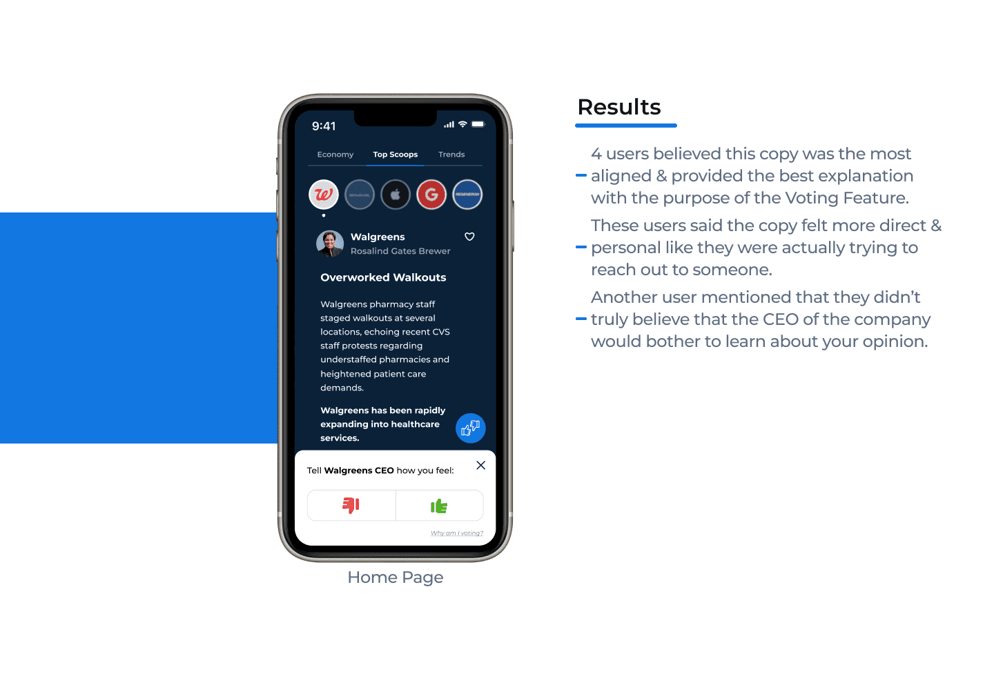
Tell Walgreens CEO how you feel?

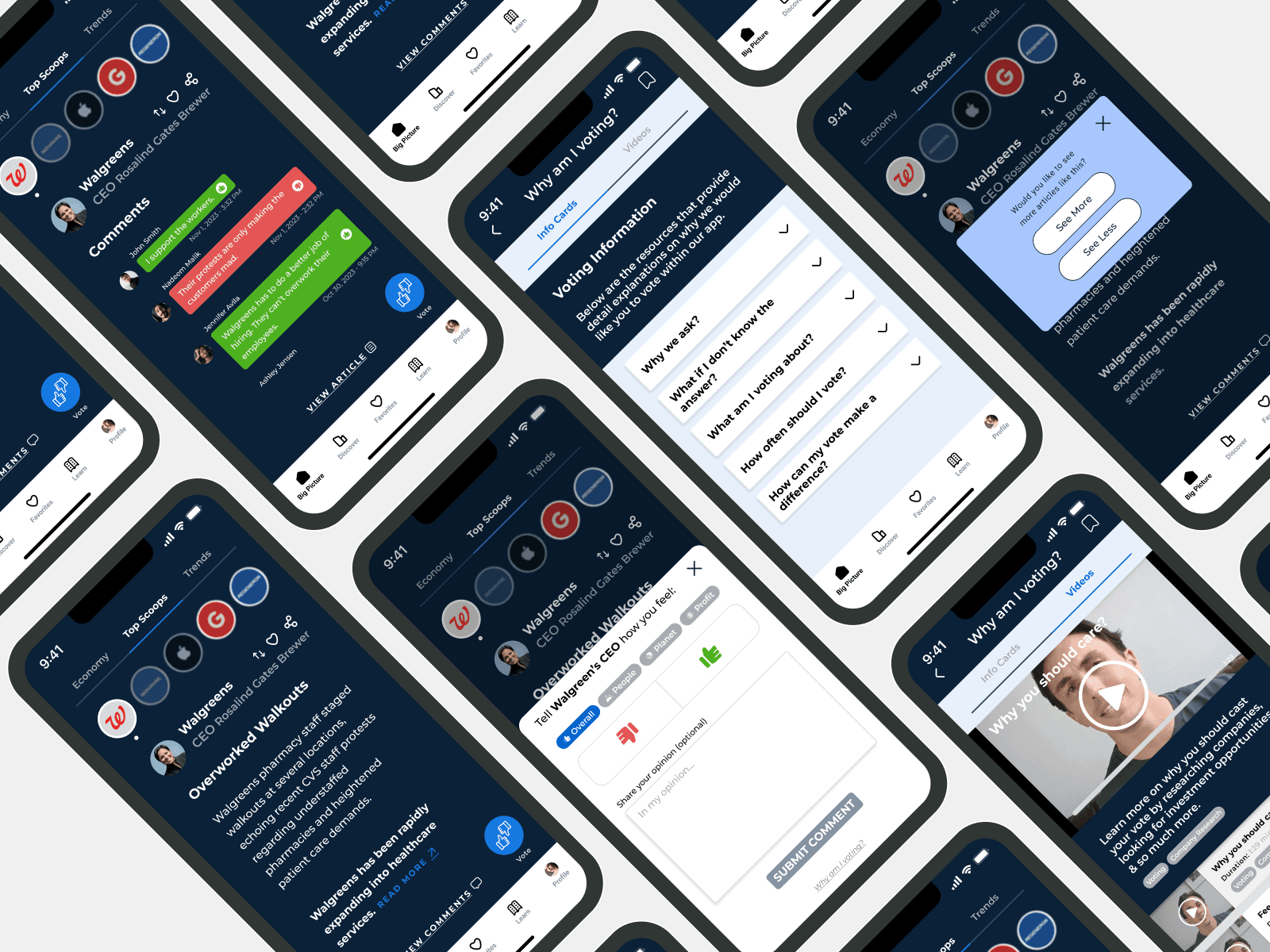
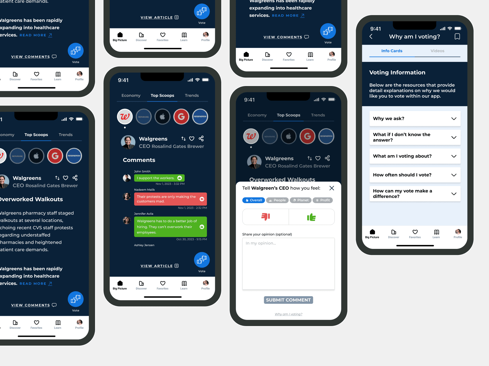
After our first round of usability testing, we proceeded to redesigning the beta app wireframes in accordance with our findings and recommendations.
High Fidelity Wireframes
These were the redesigns we made for the beta wireframes we tested during our first round of usability testing.
After redesigning the beta wireframes, it was time to conduct our second round of usability testing in order to see if our designs improved upon the voting feature.
Usability Testing - Round 2
After designing our updated wireframe iterations of the beta app base on our findings from the first round of usability testing. We were ready to test them out with 6 new participants. This time, our main goal was to see if users had a better experience with the “Voting Feature” & engaged with it more.
Updated Voting Feature Test
Setup:
We tested the 6 participants with the same 3 tasks from the first round of usability testing. These tasks are related to the Voting Feature of the app.
Discoverability & Navigation
See if users can locate the voting feature & recognize it without external guidance.
Understanding the Purpose
Evaluate whether users understand the purpose and significance of the voting feature based on the resources provided to them.
Perceived Value
Gauge whether users believe that their votes have a meaningful impact on their financial investing confidence and/ or on their financial literacy.
Discoverability & Navigation
Understanding the Purpose
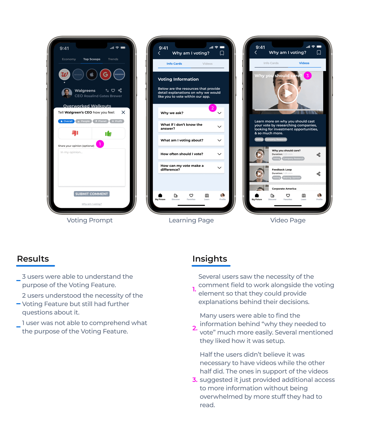
Perceived Value
Recommendations
Critical Priority
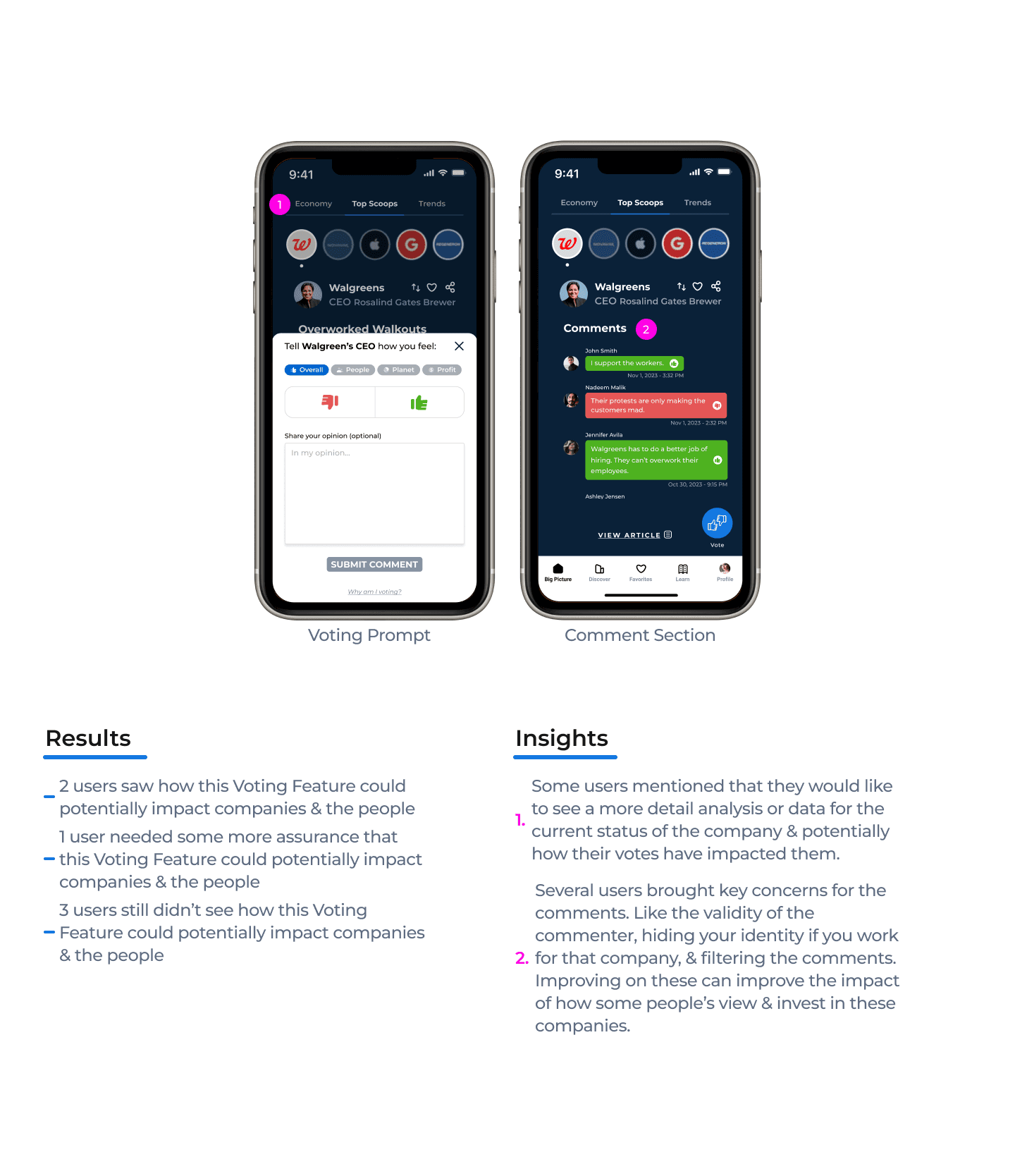
Issue:
Analysis of Companies: Some users have brought up that they would like to see the data or key points about the current status of the company.
Some key points they suggested were stock prices, recent public perception, and inputs from financial experts on the contents of “company-related” articles.
Recommendation:
Implement a page that can be accessible from the Home page (article) that showcases all of these key points of the company.
Could probably put in an Analysis tab in the “Top Scoops” navbar.
Critical Priority
Issue:
Impact of Voting Process: Many users have stated they don’t see how their votes or comments could cause any sort of impact or change on the companies since it wouldn’t really hold them accountable for anything.
For people, they already see the impact it has since they can share opinions & information amongst themselves to make better decisions.
Recommendation:
Perhaps create a page or diagram that showcases the actions of how people or readers have decided to support or stop supporting certain companies.
Major Priority
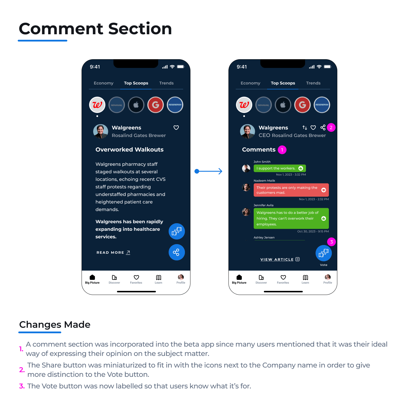
Issue:
Changes for the Comments: Several users have stated some concerns or necessary changes for the comment section.
Some of these are changing the color scheme to neutral colors, the relevance of the “thumbs” icons for the comments, verifying the validity of certain comments, hiding one’s name when commenting, filtering out comments, heading change.
Recommendation:
Change the green/red text bubbles to some neutral colors.
Possibly remove the “thumbs” icons as some users were under the impression that they could like/dislike them.
Put in an expertise title or utilize the Share Scoops logo for certain usernames (similar to a twitter checkmark). This way others could see that user has credentials & has been verified in sharing useful information.
Incorporate usernames instead of actual names just in case actual employees of some of these companies want to share their opinions without any repercussions from their employers.
Incorporate some filters in order to dilute the pool of comments that could be presented.Incorporate some filters in order to dilute the pool of comments that could be presented.
Change the title of “Comments” to Feedback since users would be learning about other people's opinions.
Major Priority
Issue:
Comments & Votes: Some users have brought up their preference for the comments over the voting since intuitively, some of them still thought the voting feature was used as a like/dislike button for the article.
With them either stating that commenting & voting need to work separately or they need to blend more concisely together.
Recommendation:
One option would be to separate the comment & voting elements into their own unique pages/prompts.
The other option would be to concisely blend the two elements further together so users know they work in correlation to one another.
Minor Priority
Issue:
Told to vote: Some users have stated that they don’t really see themselves engaging with the voting feature on their own unless they were asked to.
Recommendation:
One user suggested implementing a pop-up prompt that appears at the bottom of the article when users have finished reading it.
Minor Priority
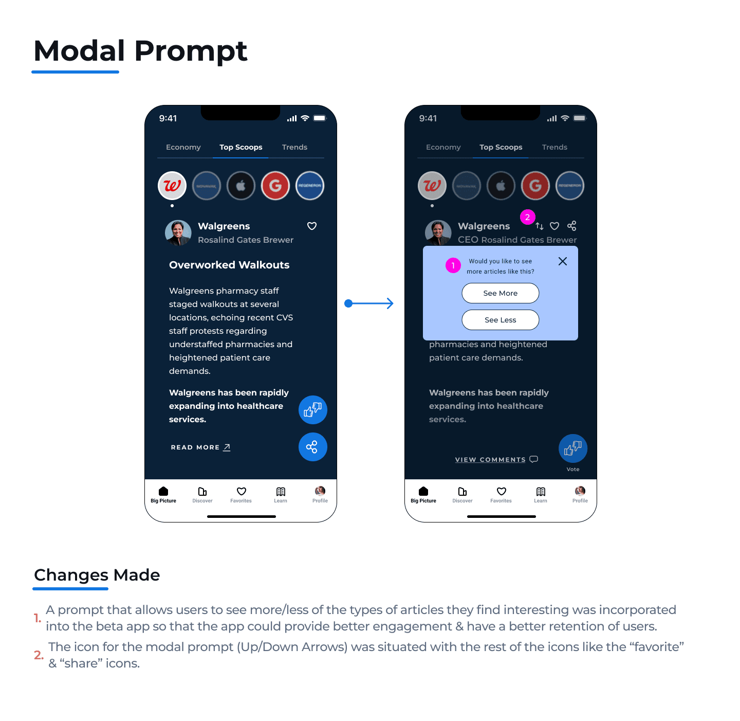
Issue:
Modal Prompt: Many users liked the modal prompt because it helps them establish the types of articles they would like to see.
Although some were curious about how exactly this prompt would work.
Recommendation:
Similar to the voting feature. Just implementing a small text link that takes them to a learning page & explains how the modal prompt works should suffice. The most common explanation is that the more times users engage with this modal across every type of article they read, the better the algorithm is at understanding their interests & suggesting articles to them.
Minor Priority
Issue:
Info Card Text: Several users were confused if the blue text for some of the info cards were hyperlinks.
Recommendation:
Change the blue color to black or a gray color, also bold or underline that text.
Overall, we believe we were successful in getting users to engage with the “voting feature” for the Share Scoops app.
Key Takeaways
More users were able to find & understand the purpose of the “voting feature” thanks to the simple changes we made from the initial wireframes. Like distinguishing the Vote button & reformatting the info on the learning page.
A lot of users saw the necessity of writing comments when casting their votes as these comments could influence them in making their decisions or provide an avenue in sharing their point of view.
Many users still felt that their vote wouldn’t have any impact on the company so that requires further research & time spent in how this app could ensure users voice have a meaningful effect on these companies.
Roadmap Moving Forward
Based off our work & the findings from our last usability test, these could be next steps:
Implement the changes we recommended from our findings in the last usability test.
Conduct another usability test after those changes have been made.
Maybe conduct a A/B testing for different variations of how the comment section would be designed & formatted.
Create some Analysis/Data pages that reflect the current status of the companies & how users votes or actions are affecting them.

© 2023 Luigy Rivas. All clever phrases & jaw-dropping designs reserved.